Worst Redesigns

This is objectively a bad design. When designing a character you usually want to direct the viewer's eyes towards their face. The original design does this by making his face nearly pale white while his cap and the collar of his cape are black. The redesign ruins this by adding to many oversaturated colors in places where they don't belong, like his cape and boots.
A lot of redesigns tend to miss the point in favor of being "aesthetically pleasing" or appeal to the artist's headcanons in some way,
 
Chinese cars already look and feel like soulless machines because they're all copycats of Teslas, from the the smooth and "aerodynamic" exteriors to their minimalist interiors that have a GIANT INFOTAINMENT SCREEN that controls most of the car, they have very few physical controls, and some cars don't even have an instrument panel display.

One example of a Chinese car getting worse with a redesign is the 2nd generation XPeng P7, which made the outsides more techy and edgy, and XPeng doubled down on the amount of tech in the interior:

1st Gen P7:
Wyświetl załącznik 7852696 Wyświetl załącznik 7852697

2nd Gen P7:
Wyświetl załącznik 7852698 Wyświetl załącznik 7852701
That thing started as a sink and progressed into a trough.

How do you take THIS-
Screenshot 2026-04-14 at 17-27-15 gc8 4 door at DuckDuckGo.png

and turn it into this abomination??
Screenshot 2026-04-14 at 17-27-45 vb wrx at DuckDuckGo.png

In fact the entire damn car industry has been looking shittier and shittier failing to realize their own concept car ideas from 2 decades ago. Benz and Bimmer absolutely shat on their almost timeless aesthetic with coke fiend nostril look of bros who buy those shiezwagens. I feel like Toyota started to redeem themselves a bit, but then took a massive shit with Lexus grill design.
 
Not the worst of the Omniverse redesigns, but Ghostfreak bothers me: the wispy head, as opposed to the round head he had in the Original Series and Ultimate Alien, makes him look like shades of a little kid dressing up for Halloween. However, I like the chains and shackles.
 
looking through this thread and it genuinely feels like the idea is to dissociate the humanity from the "corporate identity" so that it can all be slick, and interchangable. Like I imagine some hedge fund listing all their flat, black logotypes on some earnings report owned by the private equity firm monster conglomerate, and it all makes sense to me.

Same with the aesthetic design of fast food restaurants. If they're all interchangeable we save money when we change the taco bell to a burger king. What difference does it make if they're all gray boxes?

Plus, get your slop and leave, we don't want you homeless people in our shop.
 
Two items: Yugoslav banknotes and Japanese battleships

Yugo banknotes peaked in 1929, and then suffered a slow decline in aesthetics and style until the 90's when everything went to shit, politically, financially and looks-wise

From this
1000 dinara.jpg1000-Dinara reverse.jpg

To this. at least they chose a picture of J. J. Zmaj where he looks disappointed
500000000000_dinars.jpg


Following the disastrous defeat at Midway in 1942 the IJN decided to take two old battleships, the Ise and Hyuga, toss out a third of their broadside and all secondary guns, and install a flight deck in the rear. This gave them the theoretical ability to launch (but not recover) 12 Yokosuka D4Y Suisei dive bombers, and up to 12 Aichi E16A Zuiun floatplanes, which could be recovered by crane.

HyugaAerial.jpg

This was a very bad idea. In short the hangar was very vulnerable in combat situations, the airgroup too small for any real carrier work and the guns too few for a proper surface action.
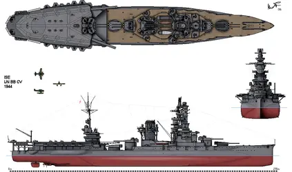
Ise after rebuild.png
 
Wstecz
Top Na dole